
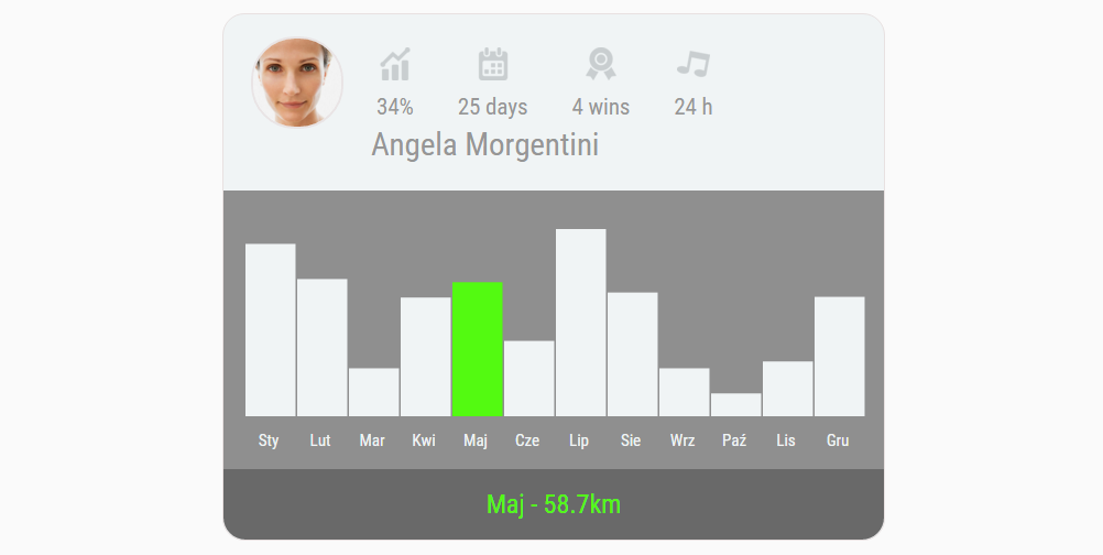
Prosty wykres do pobrania
Oto prosty szablon, który może przydać się do wizualizacji prostego zestawu danych. Oczywiście do pobrania bezpłatnie.
Często się zdarza, że potrzebujemy do naszej pracy, projektów czy nawet minimalnych wersji naszego produktu (MVP). Dziś mam dla Was klasycznie i za darmo szablon prostej wizytówki, która posiada podświetlaną wersję danych. Czyli możecie sobie zaciągnąć proste dane wizualizować je i wkleić do Waszych projektów. Jedyny mankament to fakt, że do stworzenia bardziej zaawansowanych wykresów będzie Wam potrzebna wiedza z zakresu D3. Czyli bez znajomości JavaScriptów się nie obejdzie.
[ecko_button color=”orange” size=”large” url=”https://ux.marszalkowski.org/wp-content/uploads/2016/01/prosty_wykres.zip”]Paczka do pobrania (.zip)[/ecko_button]
No to jedziemy z kodem:
HTML + JS
[ecko_code_highlight language=”html”]
<!doctype html>
<html lang=”en”>
<head>
<meta charset=”utf-8″>
<title>Analytics Chart</title>
<meta name=”description” content=”The HTML5 Herald”>
<meta name=”author” content=”SitePoint”>
<link rel=”stylesheet” href=”css/styles.css”>
<link rel=”stylesheet” href=”css/reset.css”>
<link rel=”stylesheet” href=”css/d3.css”>
<link href=’https://fonts.googleapis.com/css?family=Roboto+Condensed’ rel=’stylesheet’ type=’text/css’>
<script src=”https://ajax.googleapis.com/ajax/libs/jquery/2.1.3/jquery.min.js”></script>
<script src=”http://d3js.org/d3.v3.min.js”></script>
</head>
<body>
<div id=”wrapper”>
<header>
<img id=”face_image” src=”img/face.jpg”>
<div id=”box”>
<img id=”top_image” src=”img/statistic.png”>
<p id=”desc”>34%</p>
</div>
<div id=”box”>
<img id=”top_image” src=”img/calendar.png”>
<p id=”desc”>25 days</p>
</div>
<div id=”box”>
<img id=”top_image” src=”img/politic.png”>
<p id=”desc”>4 wins</p>
</div>
<div id=”box”>
<img id=”top_image” src=”img/entertainment.png”>
<p id=”desc”>24 h</p>
</div>
<h1>Angela Morgentini</h1>
</header>
<main>
<div class=”main”>
</div>
<script type=”text/javascript”>
function render(){
// Golden Snowglobe totals (as of 2/5/15)
var dataset = [
{„city”: „Sty”, „snow”: 75.5},
{„city”: „Lut”, „snow”: 60.1},
{„city”: „Mar”, „snow”: 21},
{„city”: „Kwi”, „snow”: 52},
{„city”: „Maj”, „snow”: 58.7},
{„city”: „Cze”, „snow”: 33},
{„city”: „Lip”, „snow”: 82},
{„city”: „Sie”, „snow”: 54.2},
{„city”: „Wrz”, „snow”: 21},
{„city”: „Paź”, „snow”: 10},
{„city”: „Lis”, „snow”: 24},
{„city”: „Gru”, „snow”: 52.3}
]
// Dimensions for the chart: height, width, and space b/t the bars
var margins = {top: 0, right: 0, bottom: 10, left: 0}
var height = 170 – margins.left – margins.right,
width = 580 – margins.top – margins.bottom,
barPadding = 2
// Create a scale for the y-axis based on data
// >> Domain – min and max values in the dataset
// >> Range – physical range of the scale (reversed)
var yScale = d3.scale.linear()
.domain([0, d3.max(dataset, function(d){
return d.snow;
})])
.range([height, 0]);
// Implements the scale as an actual axis
// >> Orient – places the axis on the left of the graph
// >> Ticks – number of points on the axis, automated
var yAxis = d3.svg.axis()
.scale(yScale)
.orient(’right’)
.ticks(0);
// Creates a scale for the x-axis based on city names
var xScale = d3.scale.ordinal()
.domain(dataset.map(function(d){
return d.city;
}))
.rangeRoundBands([0, width], .1);
// Creates an axis based off the xScale properties
var xAxis = d3.svg.axis()
.scale(xScale)
.orient(’bottom’);
// Creates the initial space for the chart
// >> Select – grabs the empty <div> above this script
// >> Append – places an <svg> wrapper inside the div
// >> Attr – applies our height & width values from above
var chart = d3.select(’.main’)
.append(’svg’)
.attr(’width’, width + margins.left + margins.right)
.attr(’height’, height + margins.top + margins.bottom)
.append(’g’)
.attr(’transform’, 'translate(’ + margins.left + ’,’ + margins.top + ’)’);
// For each value in our dataset, places and styles a bar on the chart
// Step 1: selectAll.data.enter.append
// >> Loops through the dataset and appends a rectangle for each value
chart.selectAll(’rect’)
.data(dataset)
.enter()
.append(’rect’)
// Step 2: X & Y
// >> X – Places the bars in horizontal order, based on number of
// points & the width of the chart
// >> Y – Places vertically based on scale
.attr(’x’, function(d, i){
return xScale(d.city);
})
.attr(’y’, function(d){
return yScale(d.snow);
})
// Step 3: Height & Width
// >> Width – Based on barpadding and number of points in dataset
// >> Height – Scale and height of the chart area
.attr(’width’, (width / dataset.length) – barPadding)
.attr(’height’, function(d){
return height – yScale(d.snow);
})
.attr(’fill’, '#F0F4F5′)
// Step 4: Info for hover interaction
.attr(’class’, function(d){
return d.city;
})
.attr(’id’, function(d){
return d.snow;
});
// Appends the yAxis
chart.append(’g’)
.attr(’class’, 'axis’)
.attr(’fill’, '#F0F4F5′)
.attr(’transform’, 'translate(0,’ + (height + 7) + ’)’)
.call(xAxis);
// Adds yAxis title
chart.append(’text’)
.attr(’transform’, 'translate(-70, -20)’, '#F0F4F5′);
}
$(function(){
// On document load, call the render() function to load the graph
render();
$(’rect’).mouseenter(function(){
$(’#city’).html(this.className.animVal);
$(’#inches’).html($(this).attr(’id’));
});
});
</script>
</main>
<div id=”wynik”><span id=”city”></span> – <span id=”inches”></span><span>km</span><div>
<footer>
</footer>
</div>
<!–
<p id=”footer”>All rights reserved. Unless otherwise indicated, all materials on these pages are copyrighted by the National Academy of Sciences.</p>
–>
</body>
</html>
[/ecko_code_highlight]
JavaScript (d3)
[ecko_code_highlight language=”javascript”]
var margin = {top: 20, right: 20, bottom: 30, left: 40},
width = 960 – margin.left – margin.right,
height = 500 – margin.top – margin.bottom;
var x = d3.scale.ordinal()
.rangeRoundBands([0, width], .1);
var y = d3.scale.linear()
.range([height, 0]);
var xAxis = d3.svg.axis()
.scale(x)
.orient(„bottom”);
var yAxis = d3.svg.axis()
.scale(y)
.orient(„left”)
.ticks(10, „%”);
var svg = d3.select(„body”).append(„svg”)
.attr(„width”, width + margin.left + margin.right)
.attr(„height”, height + margin.top + margin.bottom)
.append(„g”)
.attr(„transform”, „translate(” + margin.left + „,” + margin.top + „)”);
d3.csv(’weekdays.csv’, function(error, dataset) { // NEW
dataset.forEach(function(d) { // NEW
d.count = +d.count; // NEW
x.domain(data.map(function(d) { return d.letter; }));
y.domain([0, d3.max(data, function(d) { return d.frequency; })]);
svg.append(„g”)
.attr(„class”, „x axis”)
.attr(„transform”, „translate(0,” + height + „)”)
.call(xAxis);
svg.append(„g”)
.attr(„class”, „y axis”)
.call(yAxis)
.append(„text”)
.attr(„transform”, „rotate(-90)”)
.attr(„y”, 6)
.attr(„dy”, „.71em”)
.style(„text-anchor”, „end”)
.text(„Frequency”);
svg.selectAll(„.bar”)
.data(data)
.enter().append(„rect”)
.attr(„class”, „bar”)
.attr(„x”, function(d) { return x(d.letter); })
.attr(„width”, x.rangeBand())
.attr(„y”, function(d) { return y(d.frequency); })
.attr(„height”, function(d) { return height – y(d.frequency); });
});
function type(d) {
d.frequency = +d.frequency;
return d;
}
HERE[/ecko_code_highlight]
CSS (reset):
[ecko_code_highlight language=”css”]html, body, div, span, applet, object, iframe,
h1, h2, h3, h4, h5, h6, p, blockquote, pre,
a, abbr, acronym, address, big, cite, code,
del, dfn, em, img, ins, kbd, q, s, samp,
small, strike, strong, sub, sup, tt, var,
b, u, i, center,
dl, dt, dd, ol, ul, li,
fieldset, form, label, legend,
table, caption, tbody, tfoot, thead, tr, th, td,
article, aside, canvas, details, embed,
figure, figcaption, footer, header, hgroup,
menu, nav, output, ruby, section, summary,
time, mark, audio, video {
margin: 0;
padding: 0;
border: 0;
font-size: 100%;
font: inherit;
vertical-align: baseline;
font-family: 'Roboto Condensed’, sans-serif;
}
/* HTML5 display-role reset for older browsers */
article, aside, details, figcaption, figure,
footer, header, hgroup, menu, nav, section {
display: block;
}
body {
line-height: 1;
}
ol, ul {
list-style: none;
}
blockquote, q {
quotes: none;
}
blockquote:before, blockquote:after,
q:before, q:after {
content: ”;
content: none;
}
table {
border-collapse: collapse;
border-spacing: 0;
}[/ecko_code_highlight]
CSS (d3)
[ecko_code_highlight language=”css”]
button {
margin-bottom: 10px;
}
.main {
margin: 0px 5px;
}
svg {
padding: 20px 10px;
}
.axis path,
.axis line {
fill: none;
shape-rendering: crispEdges;
width: 5px;
}
text,
.axis text {
font-size: 15px;
color: #969696;
}
rect:hover {
fill: #53FA11;
}
[/ecko_code_highlight]
CSS (style)
[ecko_code_highlight language=”css”]
h1{
font-size: 180% !important;
color: #969696;
padding-left: 15px !important;
padding-top: 10px !important;
float: left;
}
body {
background: #FAFAFA;
margin: 10;
}
div#wrapper {
background: #F0F4F5;
margin: 15px auto;
width: 600px;
border-radius: 20px;
border-style: solid;
border-color: #E8E1E1;
border-width: 1px;
}
#face_image{
width: 80px;
height: 80px;
border-radius: 40px;
margin: 20px 10px 20px 25px;
border-style: solid;
border-color: #E9E4E5;
border-width: 2px;
float: left;
}
div#box{
margin-top: 30px;
float: left;
margin-left: 20px;
margin-right: 20px;
text-align: center;
}
#top_image{
width: 30px;
height: 30px;
margin-bottom: 10px;
opacity: .2;
}
#desc{
font-size: 130%;
color: #969696;
}
main{
padding-bottom: 15px;
padding-top: 15px;
margin-top: 160px;
background: #8F8F8F; /* For browsers that do not support gradients */
}
div#wynik{
padding: 20px;
font-size: 150%;
text-align: center;
color: #53FA11;
background-color: #696969;
border-bottom-left-radius: 20px;
border-bottom-right-radius: 20px;
}
[/ecko_code_highlight]
3 gotowe narzędzia
do warsztatów AI i badań UX
- Dołącz do 1,000+ UXów
- Od zera do działającego AI w produkcie — sprawdzony framework
- Bez spamu. Wyślę tylko link do pobrania
- Regularnie testuję nowe narzędzia, żeby Wam pokazać z czego warto korzystać
Jak wdrożyć AI do produktu lub organizacji?
Plan warsztatu inicjującego dla początkujących
Kanwa persony
pomoże Ci zebrać informacje na jej temat person w twoim projekcie
Card Sorting
Stwórz narzędzie do badań w kilka minut


Landing page – do pobrania bezpłatnie

Bezpłatny responsorywny szablon strony www

Lista rankingowa szablon HTML + CSS
View Comments

Email Marketing UX
Email to obecnie najpopularniejsza platforma social mediowa. Tak, nie...