

Bezpłatny responsorywny szablon strony www
Oto bezpłatny szablon responsywnej strony www do pobrania. Przyda się do prostych stron www oraz do zapleczowych stronek pod SEO.
Dziś mam dla Was mój maleńki projekt prostej represywnej strony www. Idealnie nadaje się na małe stronki wizytówkowe oraz zapleczowe pod SEO. Przygotowałem 3 rozdzielczości: klasyczną na PC, mniejszą dla małych rozdzielczości oraz tabletów i wersję mobilną. Mam nadzieję, że Wam się przyda :)
[ecko_button color=”green” size=”small” url=”https://ux.marszalkowski.org/wp-content/uploads/2016/03/responsive_website-2016-03-22.zip”]Paczka z responsywnym szablonem do pobrania[/ecko_button]
Kod HTML responsywnej strony www:
[ecko_code_highlight language=”html”]
<!doctype html>
<html lang=”en”>
<head>
<meta charset=”utf-8″>
<title>Sing up form</title>
<meta name=”description” content=”The HTML5 Herald”>
<meta name=”author” content=”SitePoint”>
<link rel=”stylesheet” href=”css/reset.css”>
<link rel=”stylesheet” href=”css/styles.css”>
<link href=’https://fonts.googleapis.com/css?family=Roboto+Condensed’ rel=’stylesheet’ type=’text/css’>
</head>
<body>
<ul class=”navigation”>
<li><a href=”#”>Home</a></li>
<li><a href=”#”>About</a></li>
<li><a href=”#”>Products</a></li>
<li><a href=”#”>Contact</a></li>
</ul>
<div class=”container” role=”main”>
<div class=”header”>
<p id=”buzz-word”>Can You Hear Me Now? Good</p>
</div>
<div class=”content”>
<h1>This Website is awesome!</h1>
<p>Most layouts used by responsive web pages can be categorized into one of five patterns: mostly fluid, column drop, layout shifter, tiny tweaks and off canvas. In some cases, a page may use a combination of patterns, for example column drop and off canvas. These patterns, originally identified by Luke Wroblewski, provide a solid starting point for any responsive page.</p>
<p>This puppet seemed to be pretty cute in the pictures, but when I received it, I was disappointed. One of the eyes was sewn in funny, so that it looks like it isn’t even there or has a black eye. Also, it doesn’t fit an adult hand. It didn’t fit my hand and I have a medium sized hand for a woman and didn’t even come close to my husband’s wrist. It is hardly even usable in other words. We were just expecting some high quality puppets for the price that they are asking and this is not what we got.</p>
<p>Most layouts used by responsive web pages can be categorized into one of five patterns: mostly fluid, column drop, layout shifter, tiny tweaks and off canvas. In some cases, a page may use a combination of patterns, for example column drop and off canvas. These patterns, originally identified by Luke Wroblewski, provide a solid starting point for any responsive page.</p>
</div>
<div class=”sidebar”>
<div class=”menu”>
<ul>
<li><a href=”http://marszalkowski.org/”>About company</a></li>
<li><a href=”http://marszalkowski.org/”>Offer</a></li>
<li><a href=”http://marszalkowski.org/”>Sepcial products</a></li>
<li><a href=”http://marszalkowski.org/”>Realizations</a></li>
<li><a href=”http://marszalkowski.org/”>Contact</a></li>
</ul>
</div>
</div>
</div>
<p id=”footer”>Szalbon stworzony przez <a href=”ux.marszalkowski.org”>ux.marszalkowski.org</a></p>
</body>
</html>
HERE[/ecko_code_highlight]
Style CSS responsywnego szablonu www:
[ecko_code_highlight language=”css”]
body {
margin:0px;
padding:0px;
}
.container {
display: -webkit-flex;
display: flex;
-webkit-flex-flow: row wrap;
flex-flow: row wrap;
}
.container div {
box-sizing: border-box;
min-width: 150px;
}
.header {
width: 100%;
min-height: 150px;
background-image: url(top_bg_big.png);
background-repeat: no-repeat;
}
.content {
width: 100%;
float: left;
}
.sidebar {
width: 100%;
float: right;
padding: 4%;
}
@media (min-width: 600px) {
.header {
width: 100%;
min-height: 150px;
background-image: url(top_bg_big.png);
background-repeat: no-repeat;
-webkit-order: 21;
order: 1;
}
.content {
padding-left: 10%;
width: 75%;
min-height: 100%;
-webkit-order: 2;
order: 2;
}
.sidebar {
width: 25%;
float: right;
min-height: 150px;
-webkit-order: 3;
order: 3;
}
}
@media (min-width: 800px) {
.header {
width: 100%;
background-image: url(top_bg_big.png);
background-repeat: no-repeat;
min-height: 250px;
-webkit-order: 21;
order: 1;
}
.content {
width: 75%;
float: left;
min-height: 150px;
padding-right: 4%;
-webkit-order: 2;
order: 2;
}
.sidebar {
float: right;
width: 25%;
min-height: 150px;
-webkit-order: 3;
order: 3;
}
}
h1{
font-family: 'Roboto Condensed’, sans-serif;
color: #595959;
font-size: 32px;
padding-top: 5%;
padding-bottom: 2%;
margin: 0;
}
@media all and (max-width: 600px) {
h1{
font-family: 'Roboto Condensed’, sans-serif;
color: #595959;
font-size: 23px;
padding: 3%;
margin: 0;
}
}
h2{
font-family: 'Roboto Condensed’, sans-serif;
color:#F7F7F7;
font-size: 16px;
padding: 14px;
margin: 0;
text-align: center;
}
p{
font-family: 'Roboto Condensed’, sans-serif;
color: #424242;
font-size: 15px;
line-height: 1.6em;
padding-bottom: 2%;
}
@media all and (max-width: 600px) {
p{
font-family: 'Roboto Condensed’, sans-serif;
color: #424242;
font-size: 11px;
padding: 3%;
margin: none;
line-height: 1.6em;
}
}
.navigation {
list-style: none;
padding-right: 2%;
margin: 0;
background: #A6A6A6;
display: -webkit-box;
display: -moz-box;
display: -ms-flexbox;
display: -webkit-flex;
display: flex;
-webkit-flex-flow: row wrap;
justify-content: flex-end;
}
.navigation a {
text-decoration: none;
font-family: 'Roboto Condensed’, sans-serif;
display: block;
padding: 1.2em;
color: white;
}
.navigation a:hover {
background: #BDBDBD;
}
@media all and (max-width: 800px) {
.navigation {
justify-content: space-around;
}
}
@media all and (max-width: 600px) {
.navigation {
-webkit-flex-flow: column wrap;
flex-flow: column wrap;
padding: 0;
}
.navigation a {
text-align: center;
padding: 10px;
border-top: 1px solid rgba(255, 255, 255, 0.3);
border-bottom: 1px solid rgba(0, 0, 0, 0.1);
}
.navigation li:last-of-type a {
border-bottom: none;
}
}
#buzz-word {
color: whitesmoke;
text-align: center;
margin-top: 7%;
margin-bottom: 7%;
margin-left: 27%;
margin-right: 27%;
font-size: 3em;
border: 2px;
border-style: solid;
padding: 1%;
}
@media all and (max-width: 600px) {
#buzz-word {
color: whitesmoke;
text-align: center;
margin-top: 7%;
margin-bottom: 7%;
margin-left: 27%;
margin-right: 27%;
font-size: 2em;
border: 1px;
border-style: solid;
padding: 1%;
}
}
#footer{
padding-left: 10%;
padding-top: 2%;
color: #424242;
text-decoration: none;
border-top-width: 1px;
border-style: solid;
border-color: #EAEAEA;
font-size: 11px;
}
#fotter a:visited {
color: #424242 !important;
}
.menu{
color: #424242;
font-size: 1.2em;
font-family: 'Roboto Condensed’, sans-serif;
line-height: 1.6em;
padding-top: 15%;
}
@media all and (max-width: 600px) {
.menu{
text-decoration: none;
color: #424242;
font-size: 1em;
font-family: 'Roboto Condensed’, sans-serif;
line-height: 1.6em;
padding-top: 5%;
}
}
.menu ul li a:visited {
color: #424242;
}
.menu ul li a:hover {
color: #ADADAD;
}
a {
color: #424242;
}
[/ecko_code_highlight]
Reset.css
[ecko_code_highlight language=”css”]html, body, div, span, applet, object, iframe,
h1, h2, h3, h4, h5, h6, p, blockquote, pre,
a, abbr, acronym, address, big, cite, code,
del, dfn, em, img, ins, kbd, q, s, samp,
small, strike, strong, sub, sup, tt, var,
b, u, i, center,
dl, dt, dd, ol, ul, li,
fieldset, form, label, legend,
table, caption, tbody, tfoot, thead, tr, th, td,
article, aside, canvas, details, embed,
figure, figcaption, footer, header, hgroup,
menu, nav, output, ruby, section, summary,
time, mark, audio, video {
margin: 0;
padding: 0;
border: 0;
font-size: 100%;
font: inherit;
vertical-align: baseline;
text-decoration: none;
}
/* HTML5 display-role reset for older browsers */
article, aside, details, figcaption, figure,
footer, header, hgroup, menu, nav, section {
display: block;
}
body {
line-height: 1;
}
ol, ul {
list-style: none;
}
blockquote, q {
quotes: none;
}
blockquote:before, blockquote:after,
q:before, q:after {
content: ”;
content: none;
}
table {
border-collapse: collapse;
border-spacing: 0;
}[/ecko_code_highlight]
3 gotowe narzędzia
do warsztatów AI i badań UX
- Dołącz do 1,000+ UXów
- Od zera do działającego AI w produkcie — sprawdzony framework
- Bez spamu. Wyślę tylko link do pobrania
- Regularnie testuję nowe narzędzia, żeby Wam pokazać z czego warto korzystać
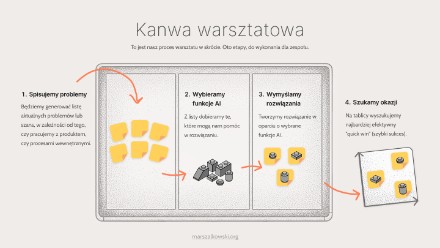
Jak wdrożyć AI do produktu lub organizacji?
Plan warsztatu inicjującego dla początkujących
Kanwa persony
pomoże Ci zebrać informacje na jej temat person w twoim projekcie
Card Sorting
Stwórz narzędzie do badań w kilka minut

Prosty wykres do pobrania

Lista rankingowa szablon HTML + CSS
Landing page – do pobrania bezpłatnie
View Comments

UX Journey Map – co to jest i jak ją stworzyć?
Co to jest Journey Map? UX Journey Map, znana również pod nazwą: UX map, Customer...